FashionZoot reports
LFW DAY 2: JONATHAN SAUNDERS A/W 2011
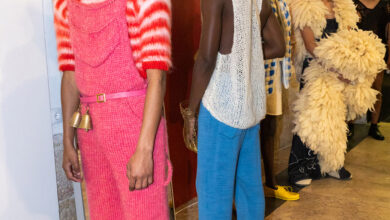
Jonathan Saunders fans and followers perfectly know that when one of his collections starts with strict lines and well-balanced colours, the best is yet to come. The bi-coloured mohair suits in purple and black or red and gray that opened the show, followed by a rusty brown pencil-skirt matched with an emerald silk blouse with a nude back and a black belt and a rusty brown top with a blue back paired with a blue skirt, were indeed just the beginning of a series of designs in kaleidoscopic colours. In the previous collection Saunders took inspiration from photographer Erwin Blumenfeld, reinterpreting in prints and colours his techniques and use of lights. For the Autumn/Winter season he moved instead from Paul Outerbridge and from his use of shades, graphic effects and carbro colour process. Suits in colourful geometric patterns transformed into prints of flowers and birds in bright colours, the latter applied also to men’s cashmere cardigans and sweaters. The hyper-real baroque prints created clever contrasts with the controlled silhouettes and the severe collared and pencil skirts: blooming lilies and poppies exploded in acid green and bright orange, turquoise and electric blue; checks in different dimensions and colours were mixed together in the same design.

A sporty elegance was replaced by the evening looks that comprised chiffon dresses with pleated hems and sequins trapped under thin tulle. While it was good to see Saunders coming up with looks for young but grown up women, it would have even better to see more menswear looks: Saunders’ bright and energetic shades are indeed what we all need in the grey desolation of winter.
By Anna Battista
See London Fashion Week coverage of Jonathan Saunders here.